Case Studies
Documenting the process behind how I create my design work.

Stable™ is an app focused on monitoring and improving the mental health of its users. It achieves this by presenting users with a series of “healing routines” ranging from 5 to 30 minutes that are custom-made to best accommodate the user’s preferences and outside conditions. The app is able to personalize these routines by offering users a series of brief, minute-long surveys—one when they first open the app and another asking them to rate their degree of satisfaction with each activitiy after having completed a respective routine. This app seeks to apply the hyper-specific algorithmic capabilities mastered by social media apps, only for an end goal opposite to endless digital engagement.
Click to view the full Figma project

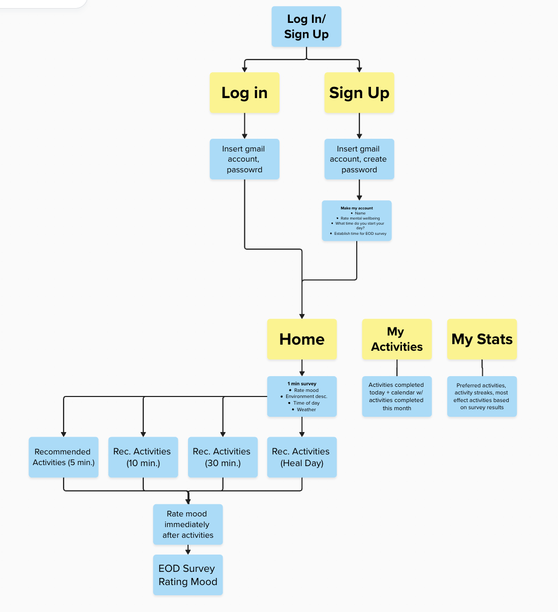
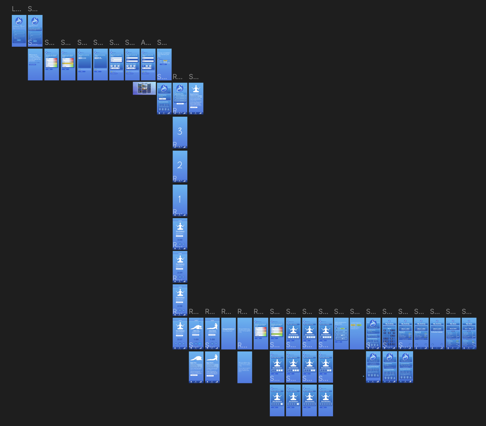
Once a general concept of what this app would offer was conceptualized, the first step was to organize & map out these thoughts in the pursuit of creating a comprehensive interface for users to navigate. All the available web pages this app offered were mapped out at three separate stages of the creation process: Once on paper at the very start, once digitally using Mural once a competitor analysis was completed, and then finally in Figma where the final mock-up was designed.

To find an appropriate color palette for this project, I studied the color schemes applied on the respective interfaces of competing mental health apps.

Brand Name: Calm
Color Palette:
#89b1ef
#616dd6
#7088de
#386e96
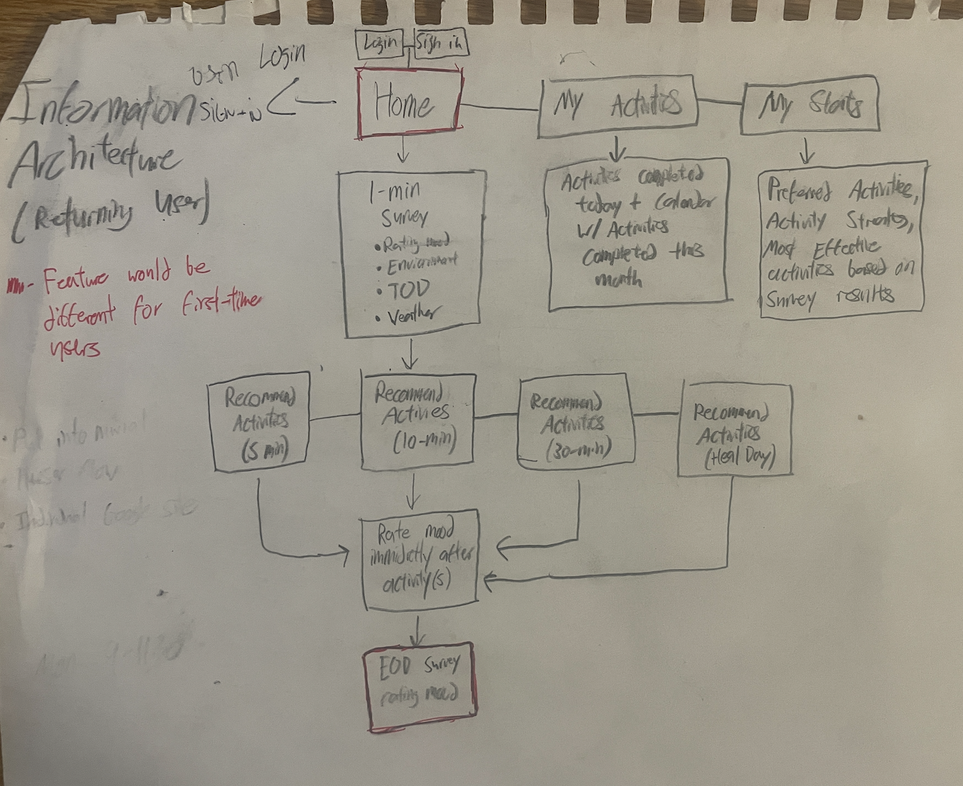
The three stages of mapping.
Brand Name: Mindshift CBT Anxiety relief
Color Palette:
#4dc8fb

#a8d8fc
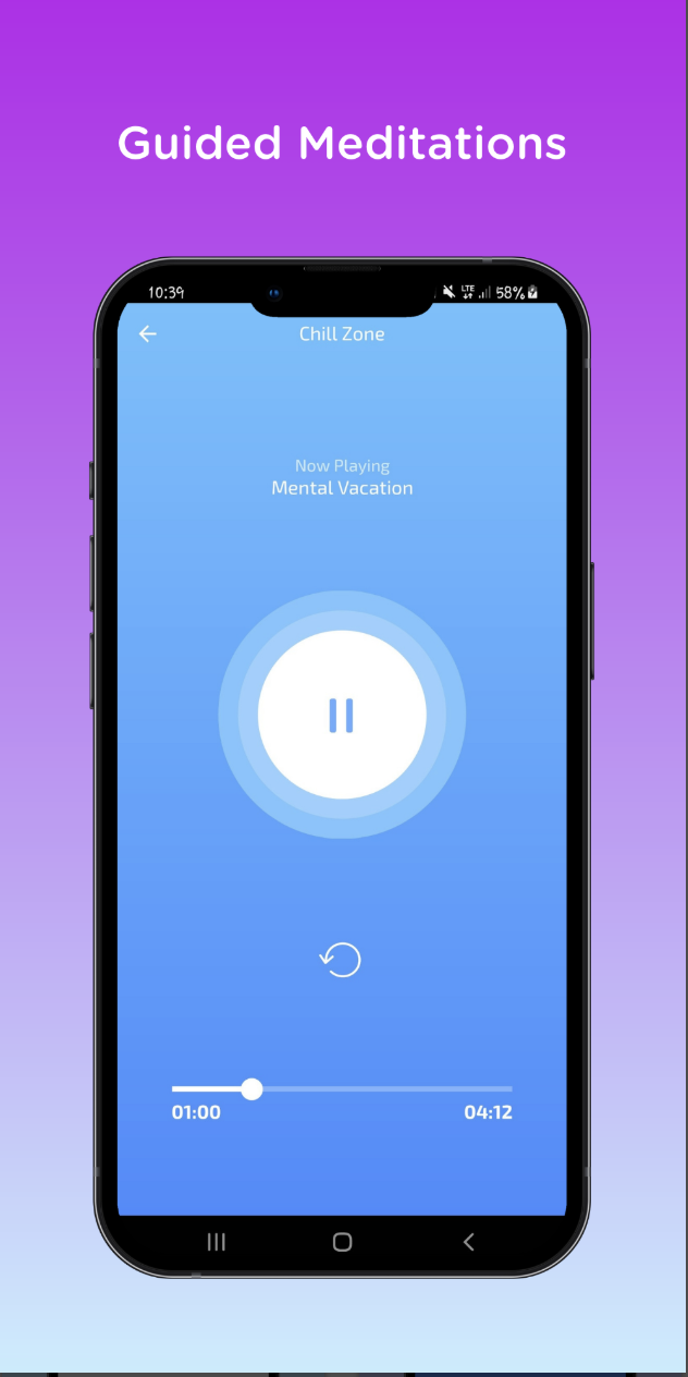
Interface:
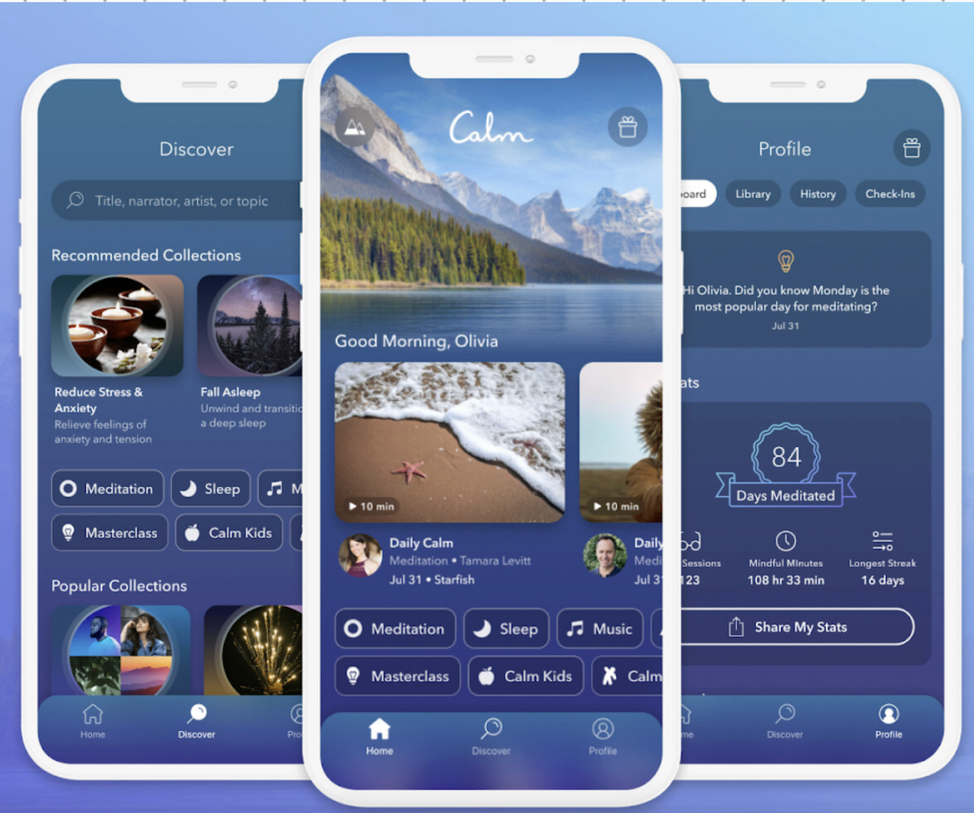
Brand Name: Calm

Conclusion
Muted blues, whites and purples are most commonly found throughout the interfaces of competing mental health brands. The soft, muted hues they choose convey simplicity and calmness, while harsher, more vibrant color choices could convey the opposite.
Selected color palette
The color palette I opted to use, with the site’s assets categorized by which color they align with (right).
Stable’s final logo features a radial gradient that has the darkest of the three listed blues as its outer color and the lightest as its center color.

I used the same following two competing apps to determine an appropriate type for this project.
Type: Diamant handwriting Regular
Sans serif
Light weight
Color(s): White
Conclusion
Mental health apps typically employ softer, thinner fonts that, similar to the their color schemes of choice, convey tones simplicity and tranquility. Sans serif type is more appropriate for the theme of these apps. Certain script fonts could also feel at place if applied sparingly.
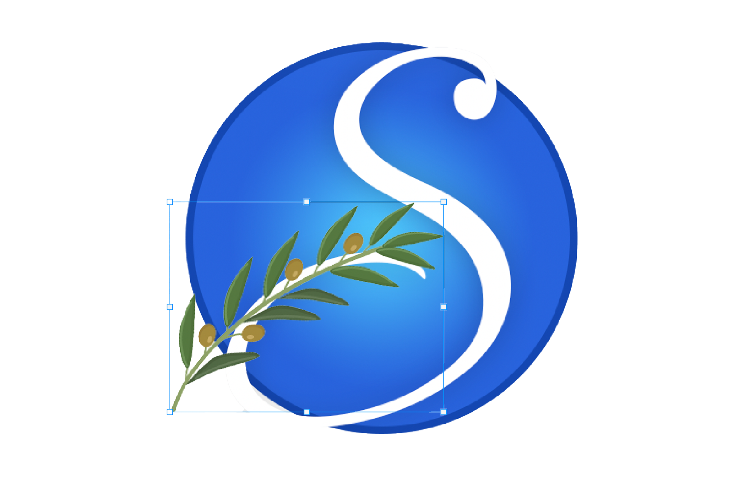
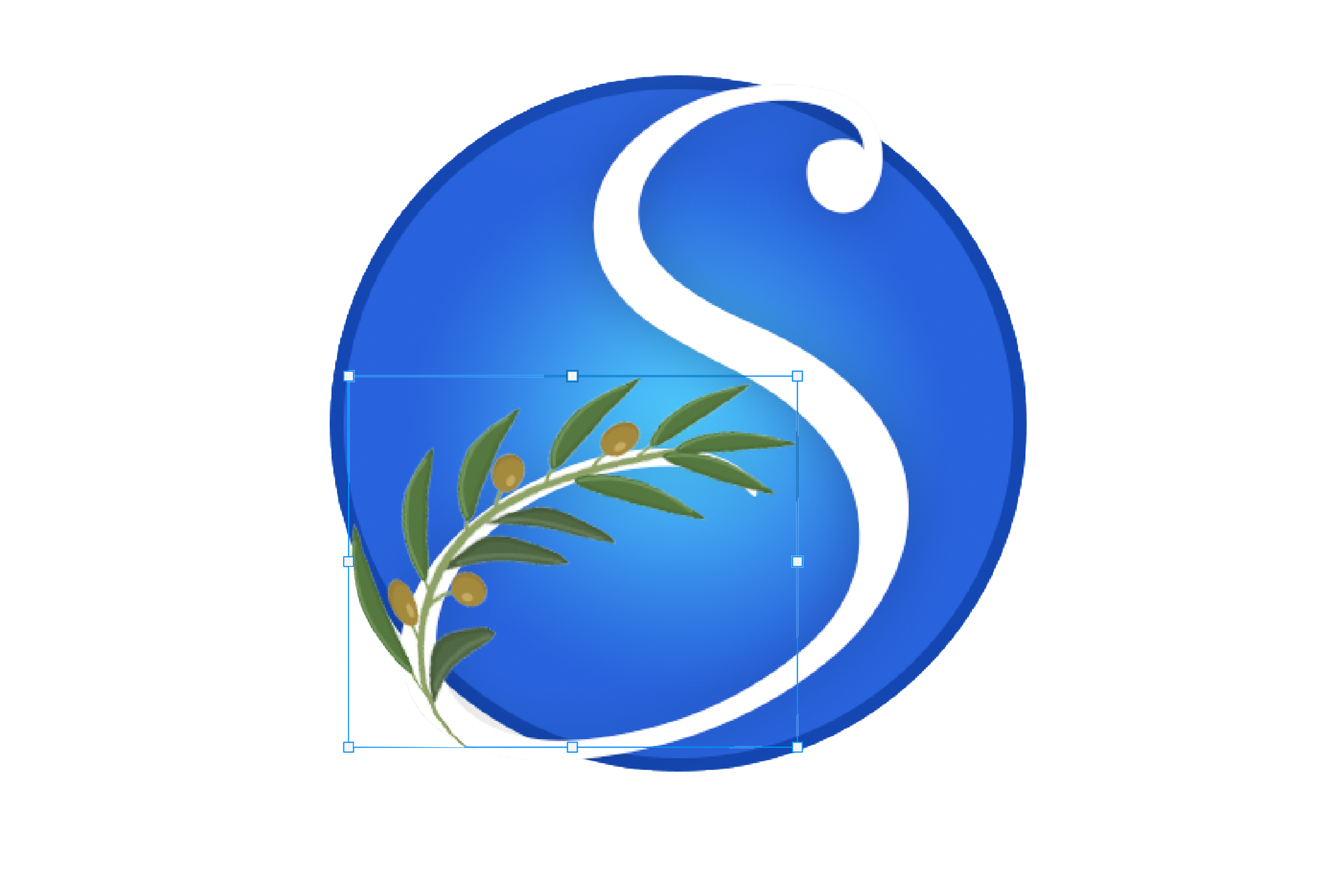
How text and clipart were merged into a single cohesive asset for my final logo design.
1 - The two layers in their original forms, layered on top of one another, no alterations made
#2863dd

Brand Name: Calm
Selected Type
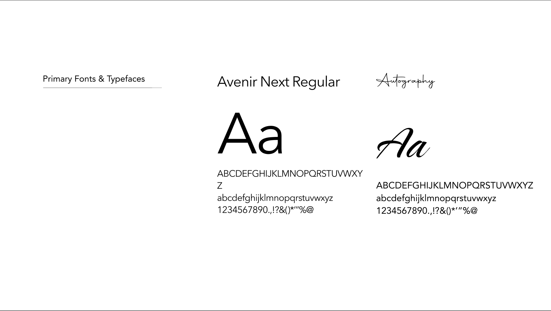
I opted to use the sans serif Avenir Next and its various available weights as my project’s primary font and the script, handwriting-esque Autography as a complementary garnish of a secondary font.

Inspired by rounds of group critique, the Stable™ logo underwent multiple iterations.
Iteration 1: Getting it all out there
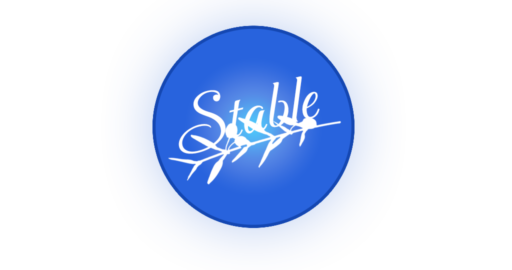

Group feedback: Unsuccessful visual hierarchy between text and olive branch.
Creating the final logo
#69c0f6
#4e88c7

#51b6f5


Solution #1: Exclusion of olive branch, focus on simplicity .
2 - Using Photoshop’s warp tool to wrap the branches’ stem around the curve of the S
#9051a0
#69c0f6
#1b59bc



Two copies of the source image are made, with one being a skintones layer and another being set to black and white. A color overlay is applied to the skintone layer. The color of said overlay should correspond to the skin tone of the individual in the source image. From there, I set the blend mode to the black and white layer to linear burn.

It’s time for final touches. The design is exported and re-imported back into the PS project. This layer will be dedicated to filters. Grain, halftone pattern, and mosiac tiles filters are applied. This layer is set to the blend mode “screen.” Each letter in the subject’s jersey is also given its own layer and white color overlay to help them pop and appear more legible in the final design.
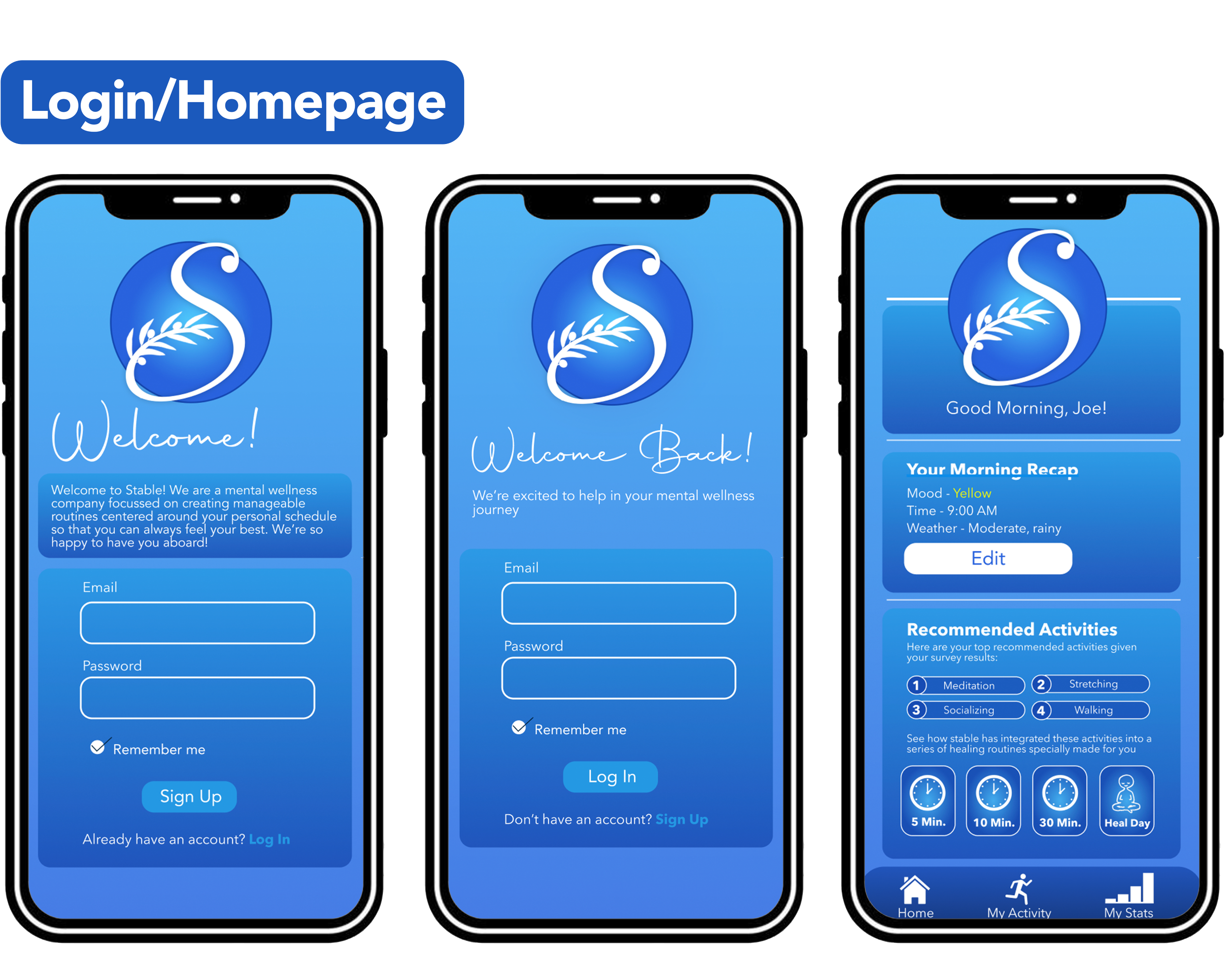
With all aspects of branding and logo design completed, I began integrating all these assets into a cohesive, interactive mock-up of an app interface in Figma.
Iteration 2: Minimalism
Interface:
Color Palette:

#fffff



Brand Name: Mindshift CBT Anxiety relief
Type: Tanseek modern arabic medium
Sans serif
Medium weight
Color(s): White, black
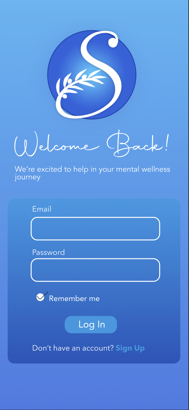
An example of a site page that utilizes both selected typefaces — Avenir Next Regular as the predominant typeface for standard text and Autography for larger headers. Given the lightness of the font and the small dimensions of a phone screen to begin with, I had to be highly conscious of legibility when working with this type. After experimenting with using the lighter Autography typeface on smaller areas of text such as app buttons, peer feedback helped me determine that using this font effectively meant using it sparingly.
Iteration 3: Integrating all assets cohesivley
Somewhere along the road social media designers tasked to created pieces centered around data visualization began flexing their creative muscles to much greater degree, raising the bar for designers across the industry.
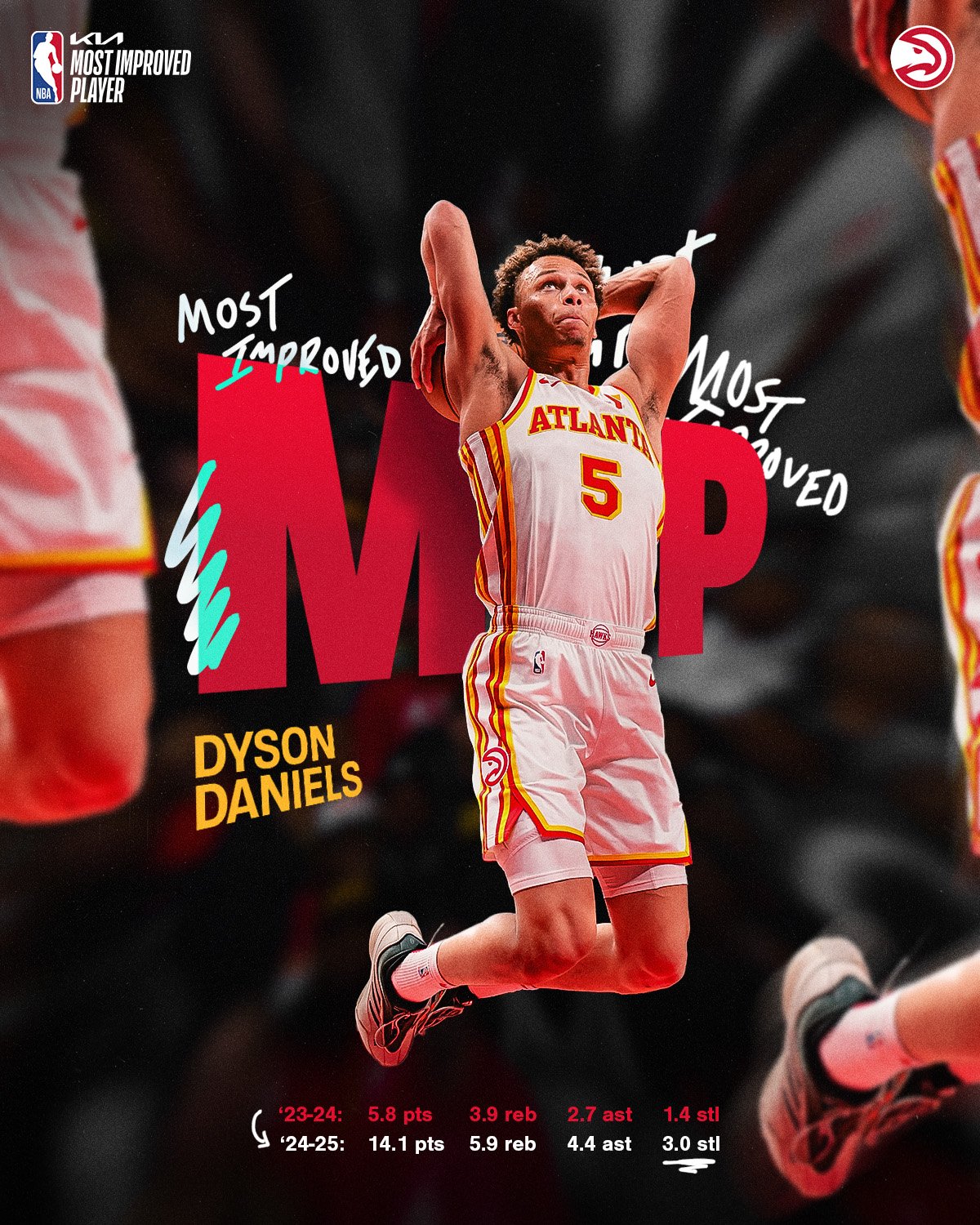
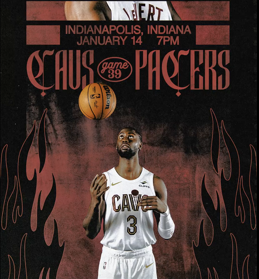



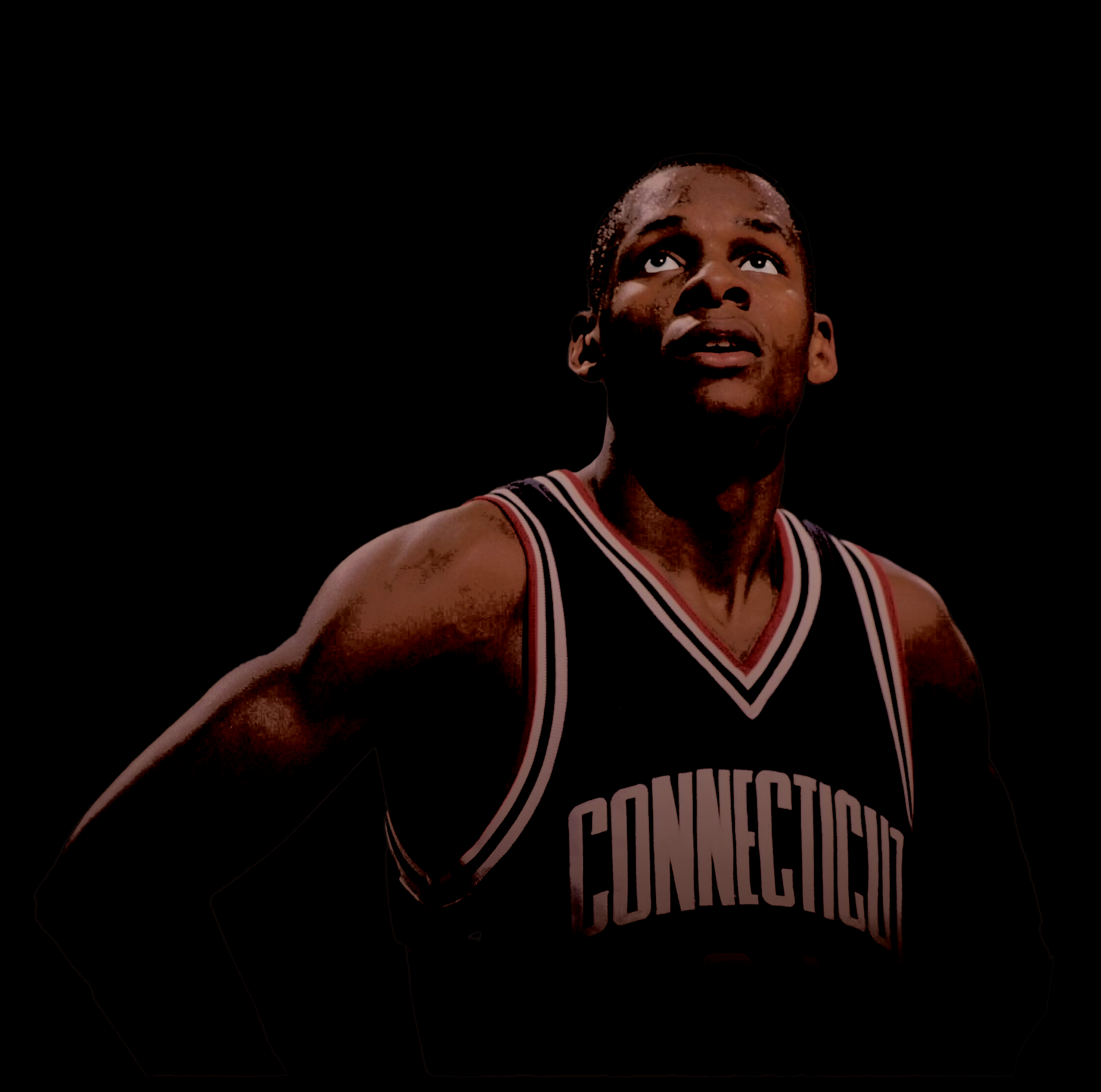
Brighter elements of the design that should pop (in this instance the subject’s eyes) are painted over using the brush tool set to an off-white hue. This is done on a separate layer, which in this example was set to 48% opacity.
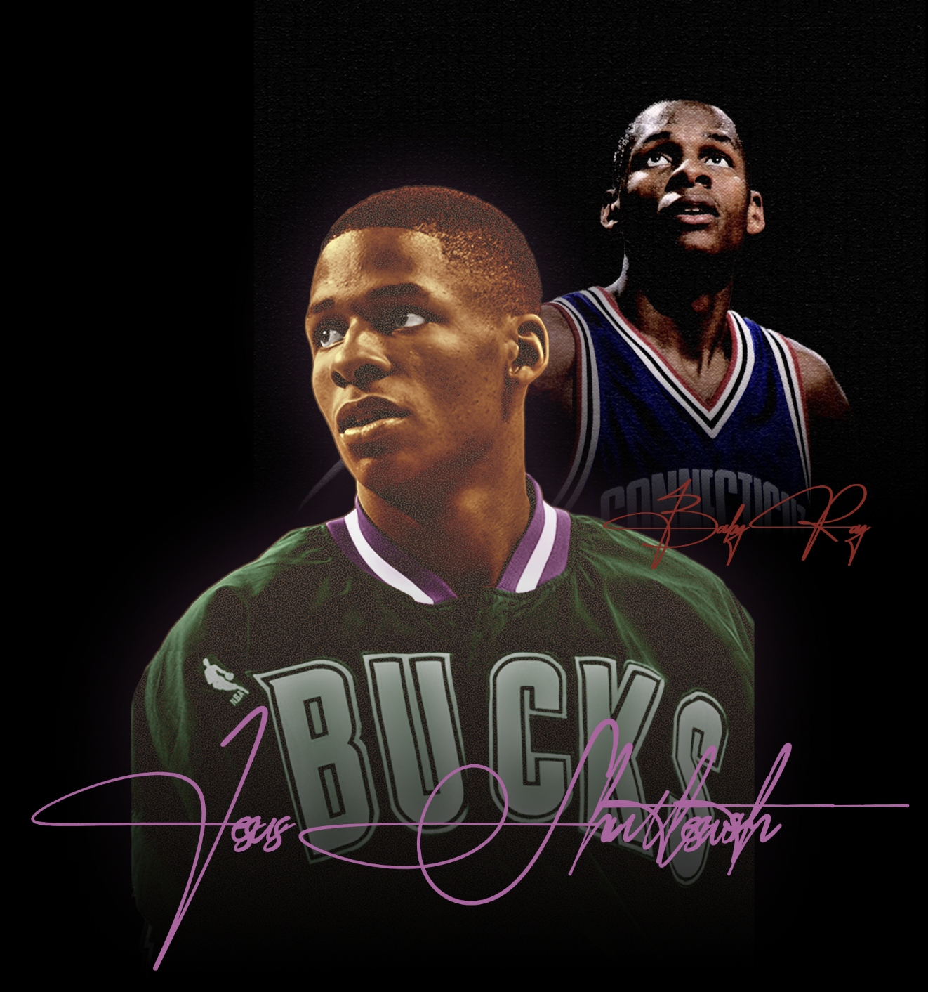

Finally, I integrate the completed image in with the design I’m working on.

Final solution: Wrapping olive branch around the tail of Stable™ “S.”
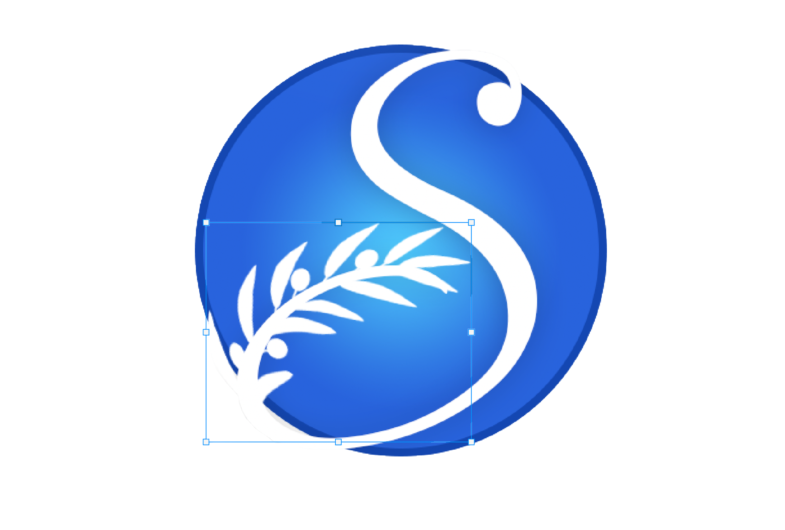
3 - Applying a white color overlay and merging the two layers into one to complete the logo
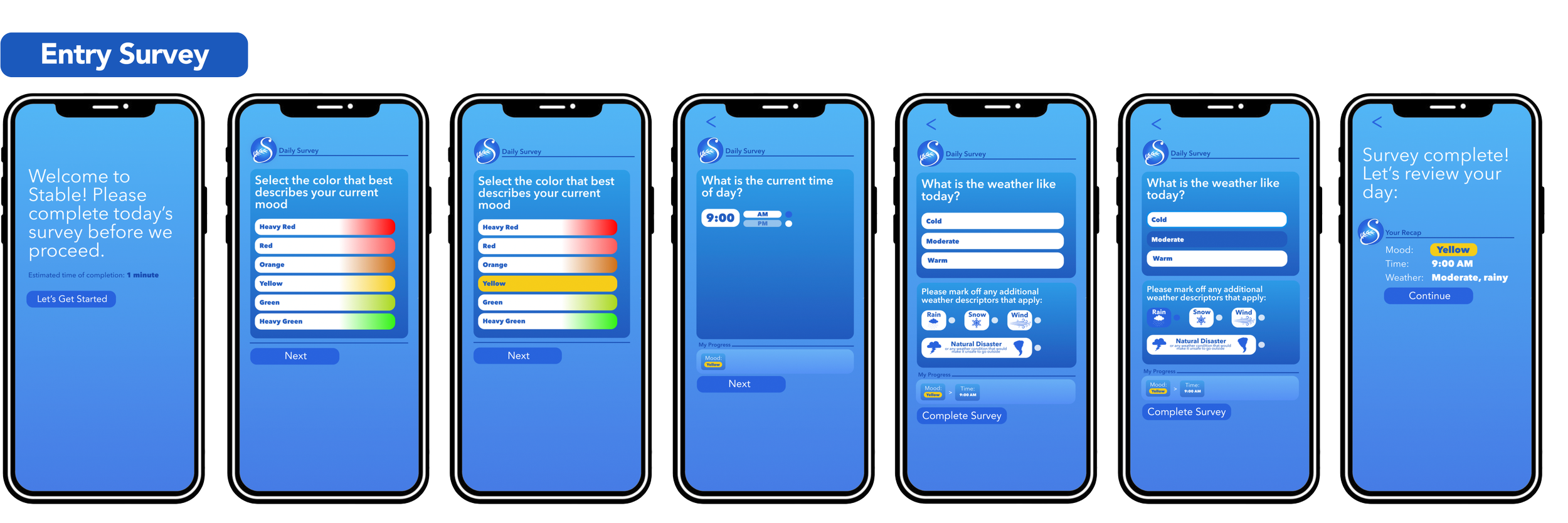
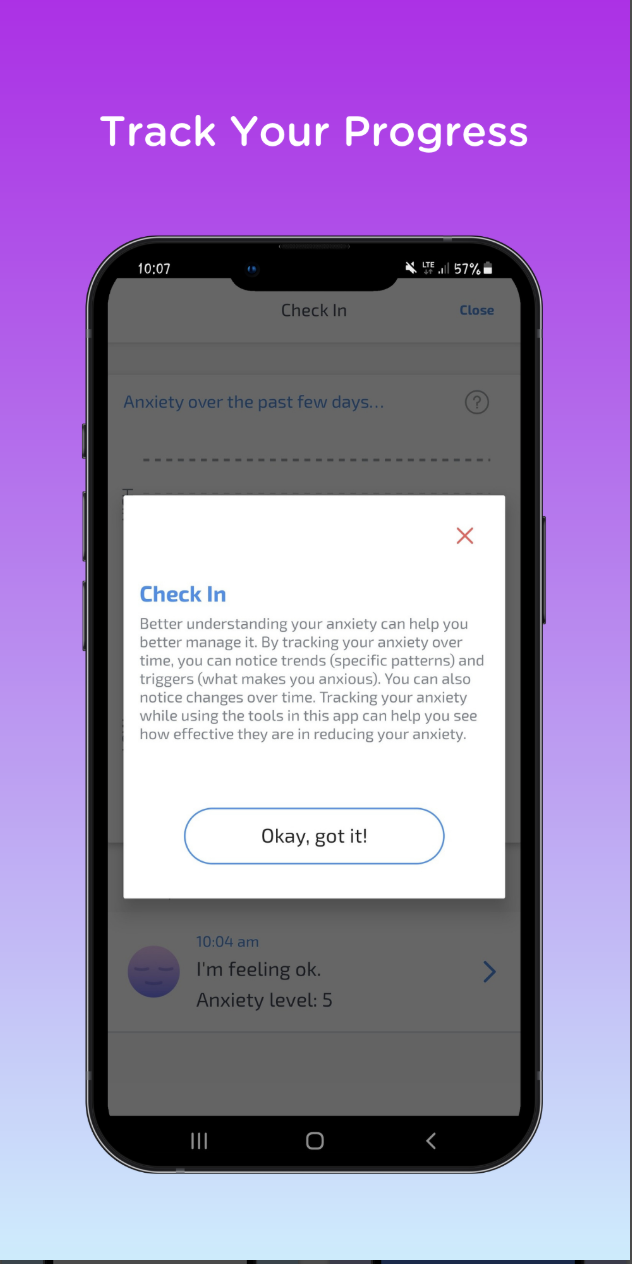
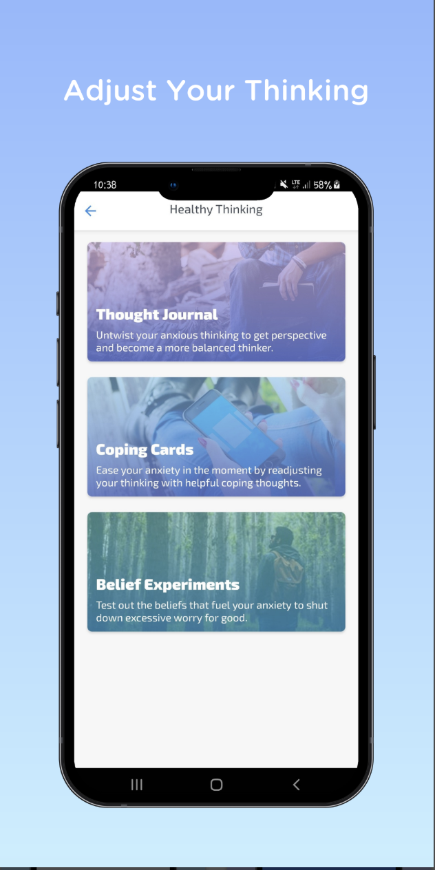
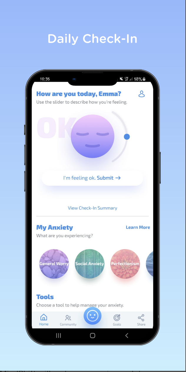
Users are greeted with brief, daily surveys immediately upon signing into the app. These surveys help Stable™ gauge the conditions of the day for the user (time of day, weather, etc.) and help the app gather data on their general mood patterns. This data collection helps the app’s routines grow progressively more personalized until users have their own custom-built routine they can seamlessly fit into any schedule.
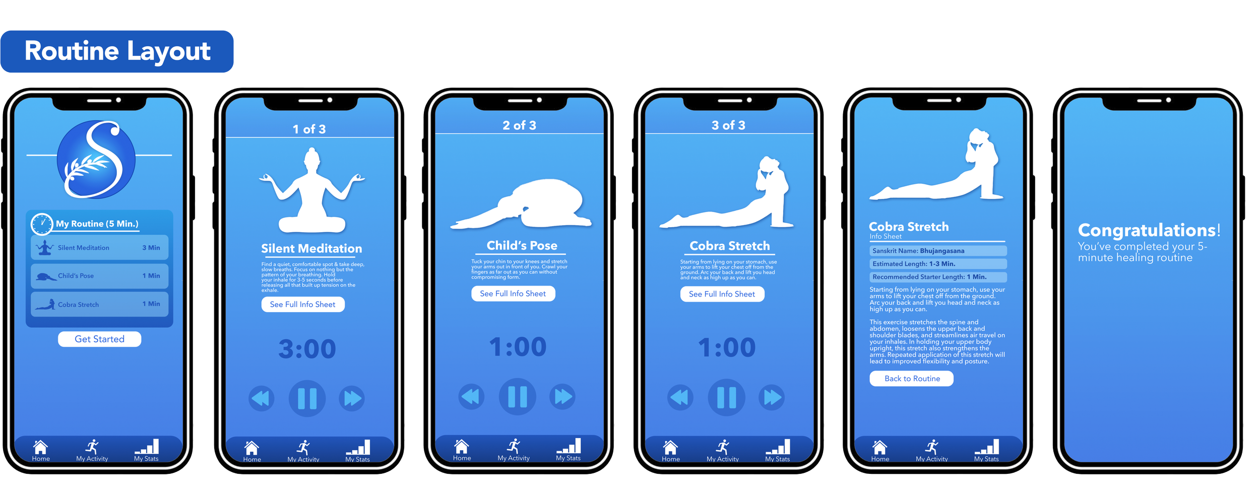
An example of how a brief 5-minute, 3-activity mental wellness routine would be presented to Stable™ users. Prior to starting a routine, users are offered a preview tab displaying to them the personalized activities that Stable’s™ algorithm has specially selected for them. Users can pause midway through a routine and have the autonomy to skip an exercise of activity if they so please. Info sheets with information on each respective activity are available for users to browse at any time throughout the routine.
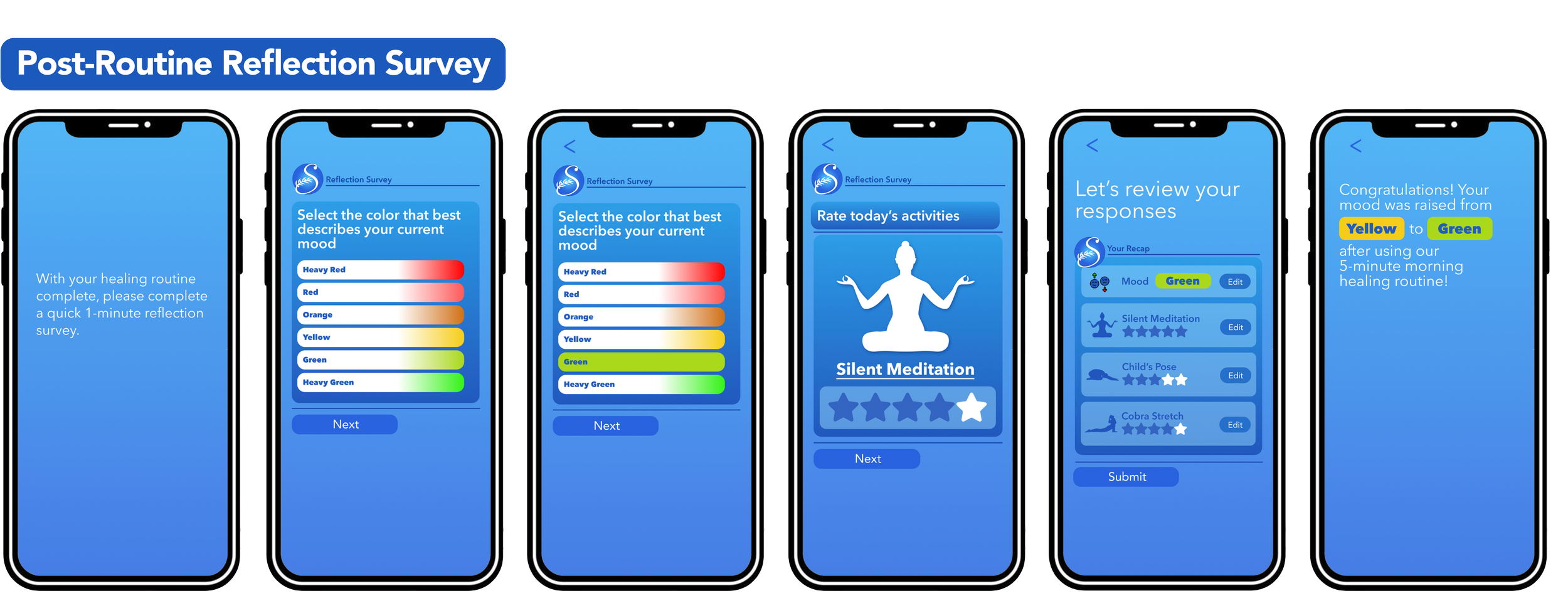
Stable™ offers its users a post-routine reflection survey, with some repeating questions from the opening survey and other new ones specifically pertaining to the exercises and activities the user has just performed. This survey is used to help gauge which activities correlate most with a boost in mood. Activities that users rate the lowest or report having a stagnant or worsened mood after performing will be less likely to appear in future recommended routines.
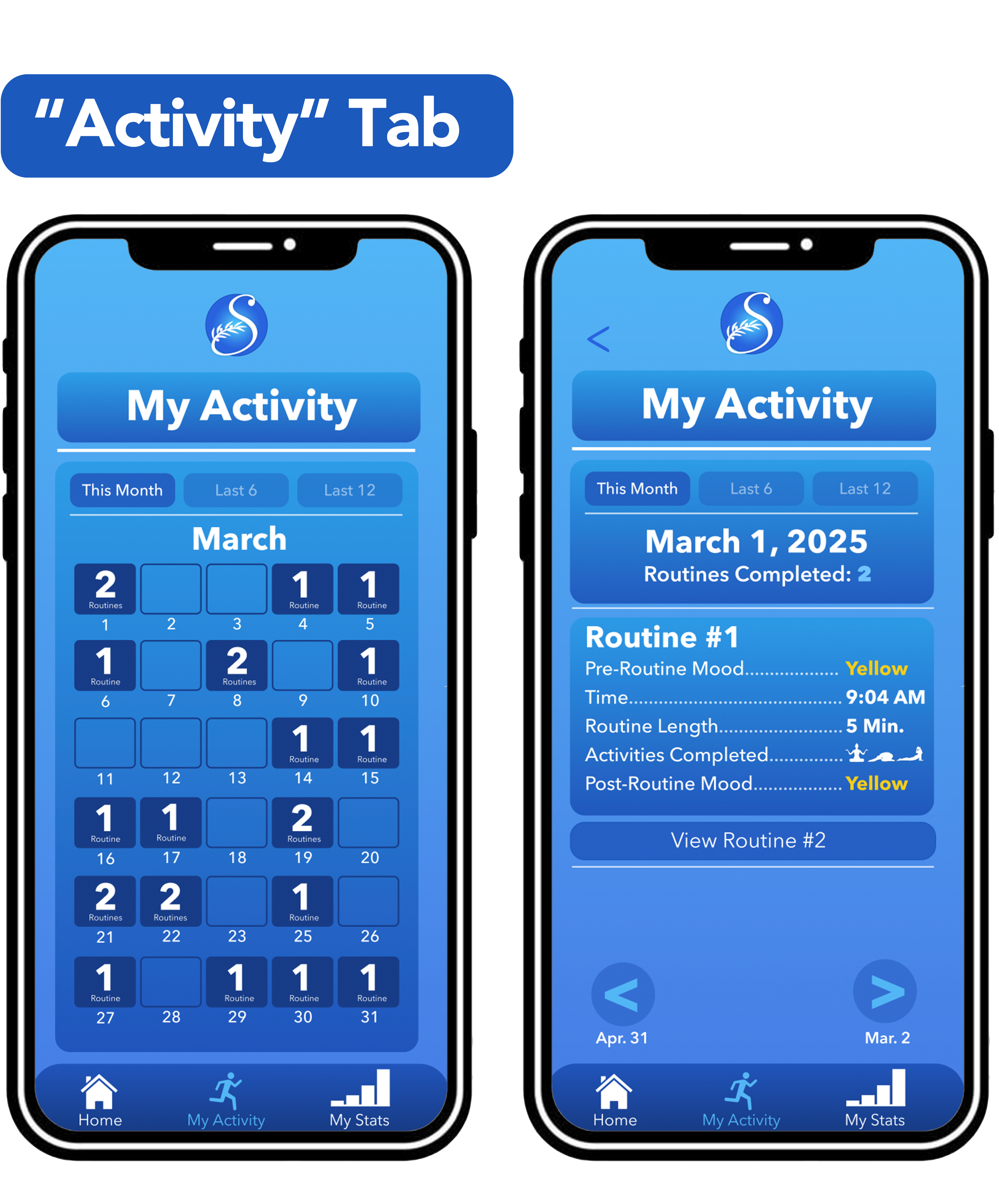
Tracking the frequency with which users complete routines. Users can click on any day of the calendar to see a more in-depth breakdown of the routines they completed on any respective day.
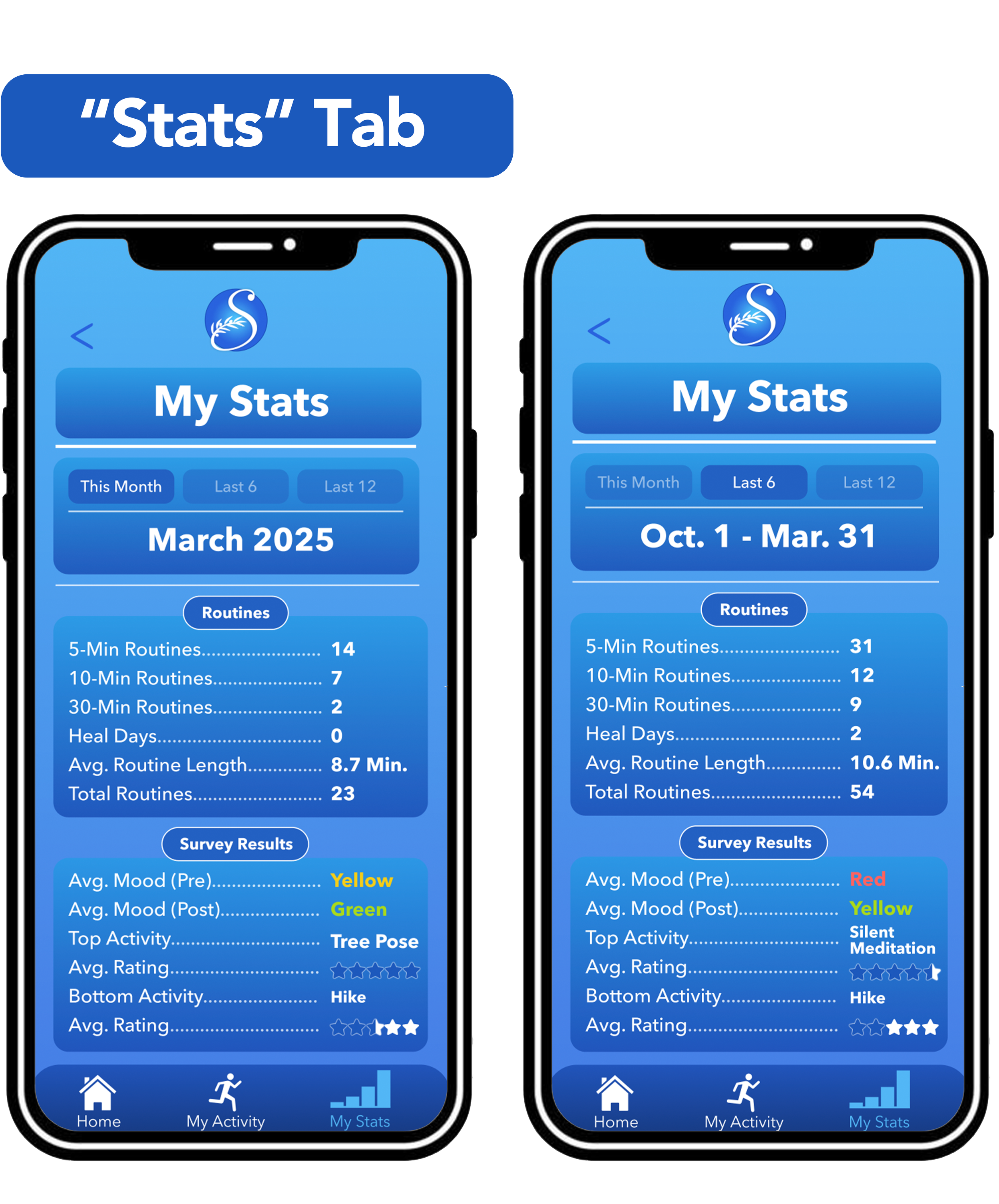
A large-scale breakdown of users’ survey results.

As a graphic designer, there are no projects that get my creative juices flowing quite like vintage apparel designs. While my designing journey was first realized when I discovered a passion for sports graphics and data visualization (examples available in my portfolio), I quickly noticed that the most complex and well-made of these projects could also pass as legitimate art pieces that displayed a mastery in composition, visual hierarchy, typography, and color theory. While these pieces effectively displayed statistics or messages similar to their more basic contemporaries, the primary intent of the designer felt more centered around aesthetic and visual cohesion. As the designing landscape grows more saturated, works of this nature are growing to become the norm in the industry, and I find it imperative that I myself work to master the blueprint laid out by these designers at the forefront of this industry.
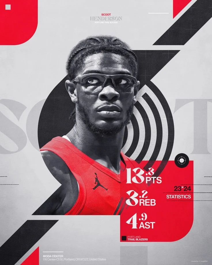
Designers at the Forefront
Inspiration is everywhere once you start searching for it. The following people are laying out the blueprint in sports social media and apparel design:
Gage Duchy (Celtics head video producer)
Flynn Bluett (Hawks Designer)
EthanJDesign (Designer, 3D modeler & animator for the NBA)
Ryan Shadle (Cavaliers senior designer & social media manager)
Bailey Mincer (Cavaliers art director)
Doron Studio (Apparel designer & PS asset packs creator)
Ronnie Fieg (KITCH apparel CEO & designer)
Holly (Hollygraphics.com)
Paul (@__bypaul, freelance creative designer & master of photomanipulation)
SHUTUPPLS (Apparel company)
henessy aesthetics (Apparel company)
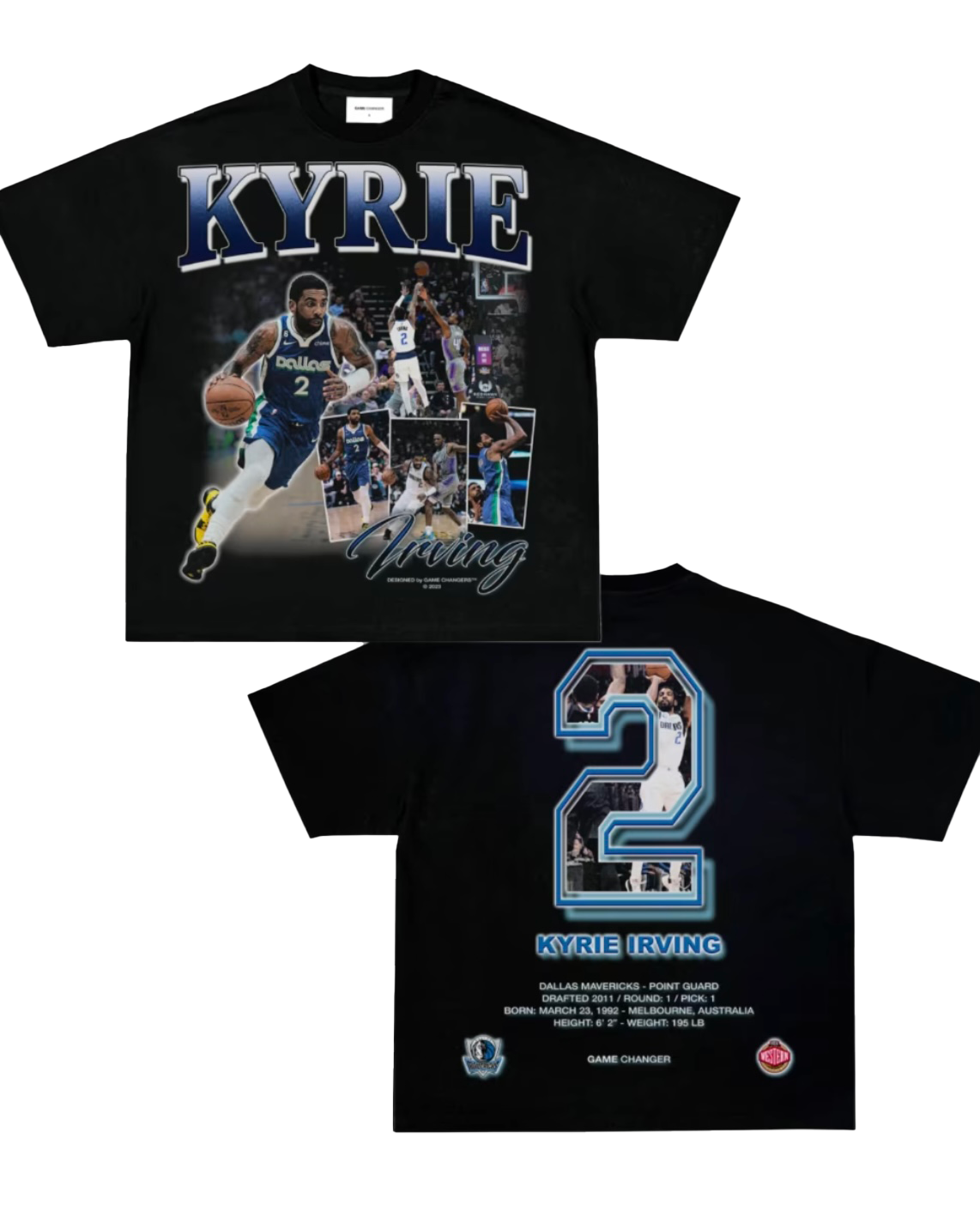
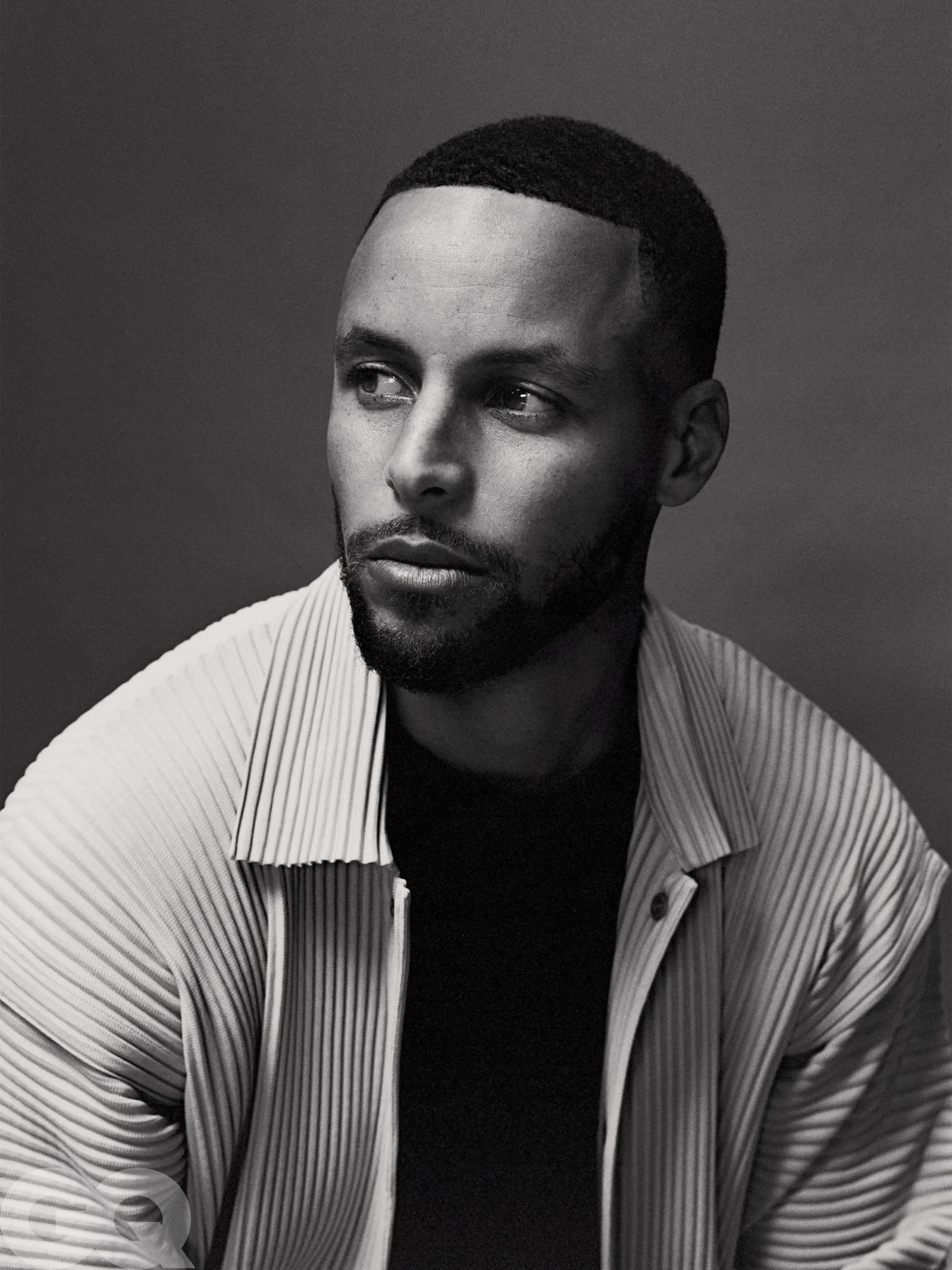
From this Inspiration came Council Apparel
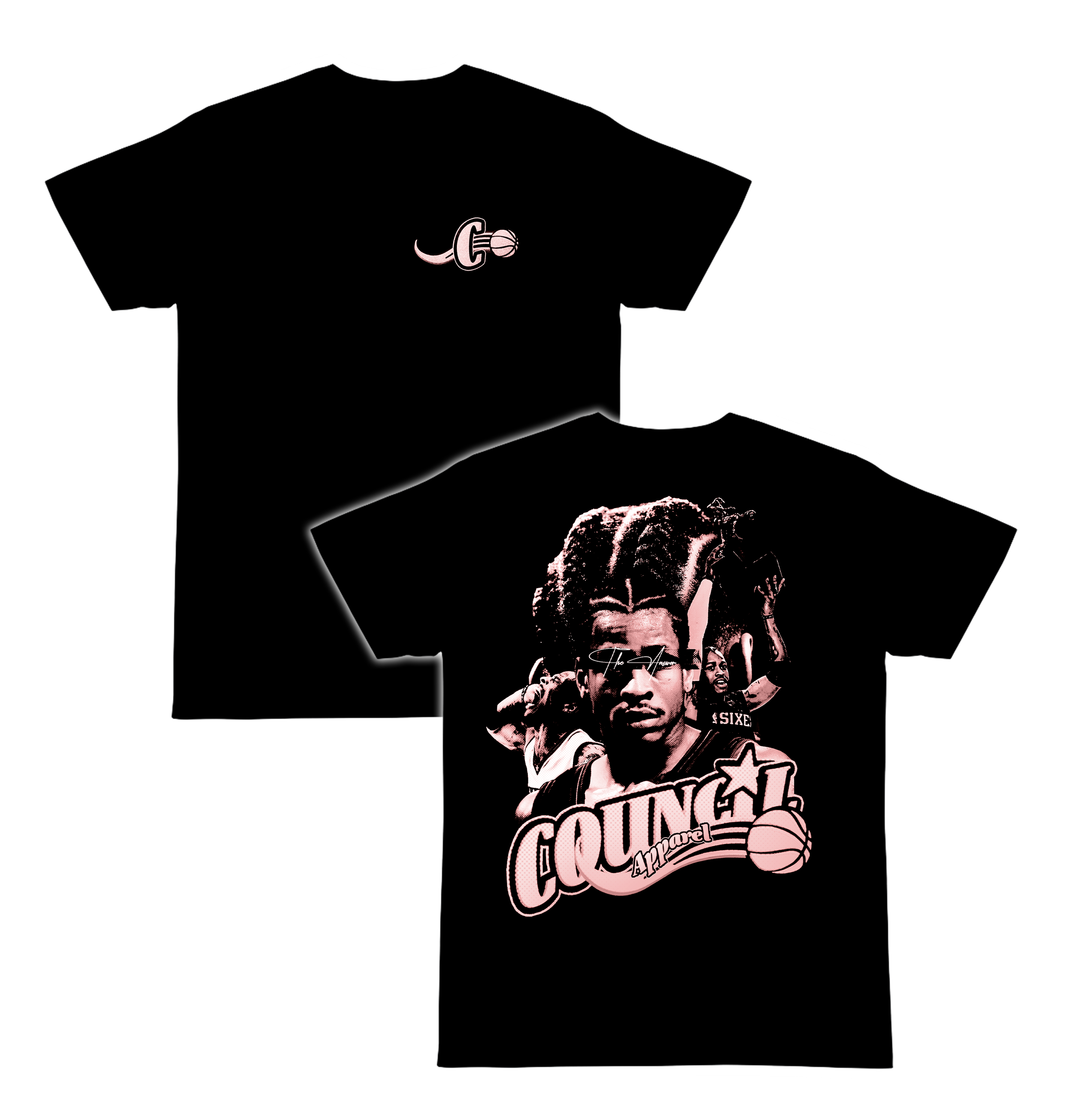
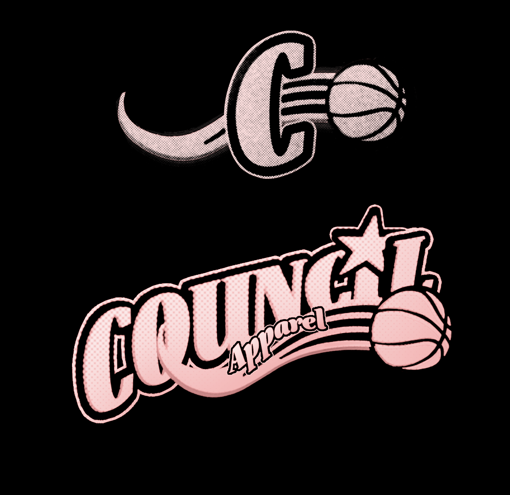
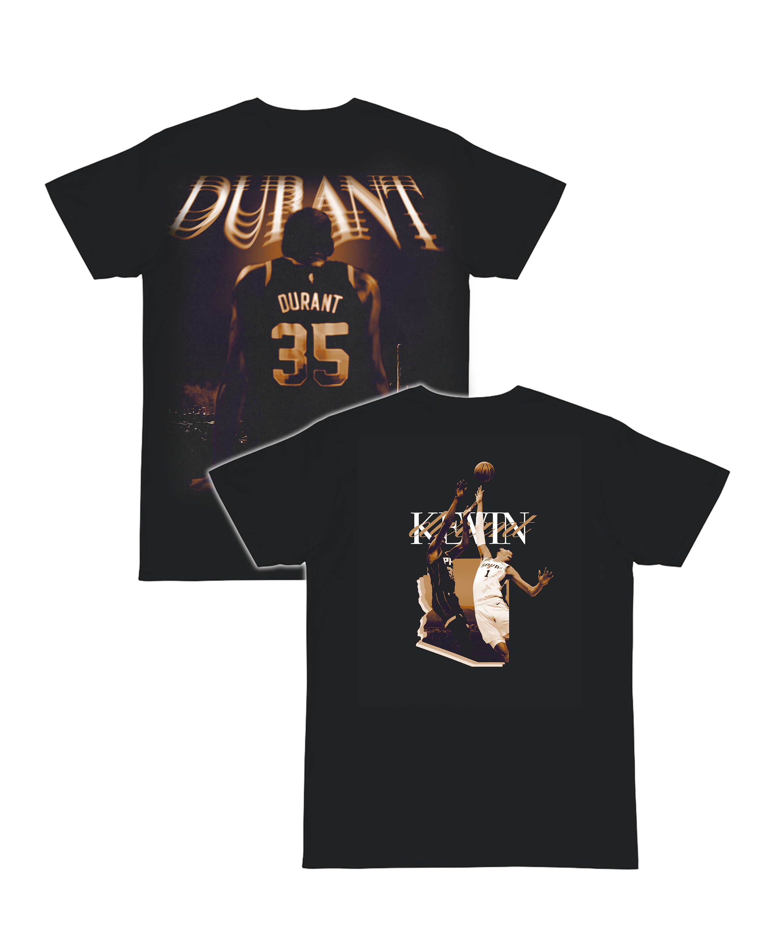
I created Council Apprel, a mock apparel company as an outlet to experiment with the styles displayed by those in the industry I take inspiration from. Taking inspiration from these artists and many more, I began experimenting with Photoshops various texture, filter, and blend tools. In working with this particular rugged, gritty, vintage design style, you learn that it takes a large accumulation of components and layers to competently fill a t-shirt. With this in mind, visual hierarchy and composition become major focus points that designers must always be conscious of — especially when dabbling in a style where it is commonplace to display a diverse array of images in an almost collage-esque fashion.
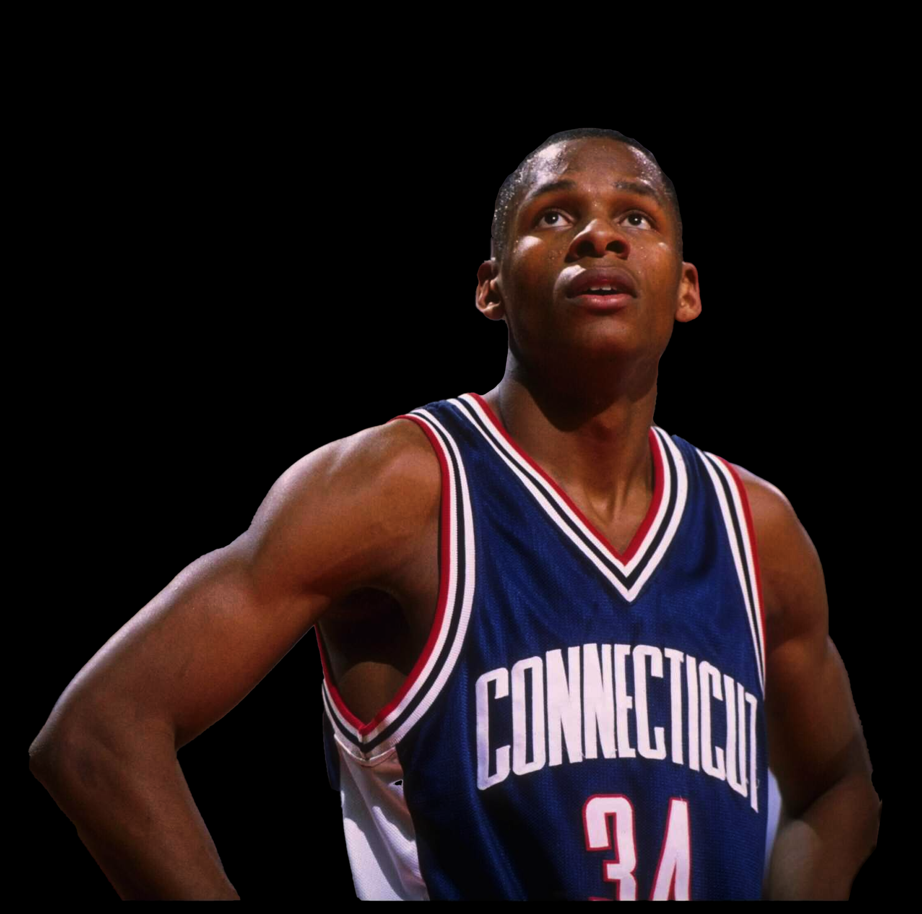
Aspects of the photo that feature color tones different than the skin tone of the subject — such as the details in his jersey — are cut out using the lasso tool and given their own layers and color overlays. These jersey layers are set to the “color” blend mode, although experimentation with a variety of blend modes warrants the best outcome. The blues and reds in the subject’s jersey should now appear more saturated and vibrant.
The process begins with Photoshop’s lasso tool, which I use to create a cutout of the selected image.

The process in action

My final type study, as depicted in my UI kit created in Figma.
